Whether you’re the owner of a small corner shop or a multi-million pound chain, getting your brand lighting right can be the key to drawing in potential new customers.
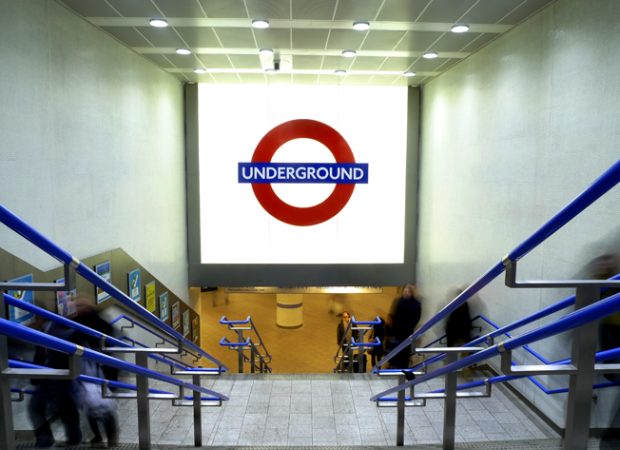
There are many factors to consider when planning brand signage, and knowing your company and consumers is vital. When you’re aware of who you want to attract, the doors will open to a plethora of font and colour options. A long standing company may be recognised by a particular logo, making it paramount for the lighting design to adhere to the original style. Kings Cross Underground Station recently installed an updated sign over their new entrance, and while the original logo of the underground was deep set in the project, the designers were able to inject contemporary flair using white glass and an internal lightbox to enhance the effect of high power linear LED units. By using colour-matching and innovative lighting techniques, this design has retained the underground brand that we know and love.

When analysing the brand lighting of the world’s most successful companies, it is clear to see that on many occasions, less is more. Well-spaced typography and a simplistic back light has resulted in great popularity for the kings of the fashion world. Gucci’s use of very thin front is paired with a gloss chrome finish and led lights within its lettering to reflect its high class. Meanwhile Prada achieves a luxury visual with thicker and simple capital type with gold finish, using translucent acrylic backing and a soft illuminating light source for a sophisticated glow from the inside-out. These two chic stores join an extended family of bespoke clothing and jewellery companies using bold and metallic brand lighting with back lights and pattern to enhance their name on the street, while maintaining their loyal fan base.
For those looking to attract regular consumers, such as night clubbers, attraction is key. These venues tend to opt for fluorescent lighting and a recognisable image. Pacha’s brand is known across the world for its vibrant crimson cherries. The franchise uses bright tubular lighting to create the round fruit, meanwhile disguised fittings lift the cartoon-like lettering off the dark wall to create an eye-catching 3D effect. Pacha has taken advantage of the darkness during which it opens its doors and created a brand light like no other to draw in both new and regular music lovers every night.
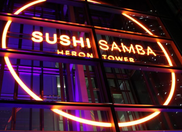
We manufactured and installed the brand signage (below) with MadeThought, for Sushi Samba at London’s Heron Tower. Illuminated 24 hours a day, with a 5 metre diameter striking brand design, it is set in the lift shaft of the towering 46 storey building.
To offset the sharp defined lines of the brand logo, the surrounding shaft space is filled with a wash of colour changing light provided by high output RGB fittings.
Situated on a major junction on Bishopsgate, the feature has become a glowing landmark in the heart of the City.

But it’s not just niched companies that get brand lighting right. Household names across the globe have achieved great success and longevity due to their design choices. Coca Cola’s logo has many faces around the world, each using light in a different way to sell their brand. We all recognise their Christmas truck that illuminates our streets and televisions during the festive period. A graphic print of Santa Clause is framed by a fluorescent red border and spotlights, attracting attention wherever it travels. In shops and outside bars, you may see its name in varying fonts and colours, from rounded white italics, to detailed scarlet curls visually akin to its bottle appearance. Other logos feature see-through lettering, lit up by neon white light and encased in an opaque red box.
Each variation of Coca Colas’ brand lighting creates astounding impact, proving that for the overall success of your company, it’s not only the light that matters, it’s the whole package.
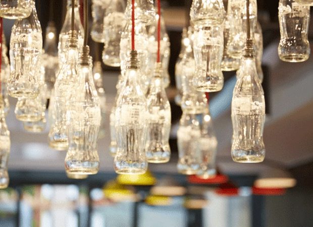
We worked on the refurb of the new Coca Cola office in London for Morey Smith. The refurb features innovative bespoke lighting including the feature wall below by Acrylicize and also renowned artist Stuart Haygarth designing a bespoke lighting installation for the centre of the office.
Below you can see the bespoke chandelier we created made from recycled glass coke bottles.
“The new offices create an inspiring, collaborative and modern space for us all to work in- it manages to reflect the values and culture of our company today but it also celebrates the 128 -year heritage of the Coca-Cola brand.” Coca Cola HR

